KinderCare — Pediatric Health Companion
A mobile prototype that simplifies pediatric appointment booking, shared caregiving, and preventive-care tracking for multilingual, multi-caregiver families.
Project Background
This educational project was born out of a personal need — and a shared experience among many parents who recently moved to Germany.
As a parent myself, I often struggle with booking pediatric appointments.
My experience prompted me to explore the challenges other caregivers face when managing pediatric appointments and health-related responsibilities — and to consider how a digital solution could improve access, coordination, and peace of mind for families.
Deliverables
Research • Empathy maps & Key pain points • Personas • Journey map • IA • Wireframes • Usability study & Design iterations • Hi-fi prototype • Style guide
All key artifacts are available below — click to explore research, wireframes, and prototypes.
▶ Details
- ✅ Research summary — interviews n=8, survey highlights, 5 key insights
- ✅ Empathy maps & Pain points — one user maps n=8, aggregated n=3, 3 key pain points
- ✅ Personas — 1 primary, 2 edge-case
- ✅ Journey map — 1 primary user's journey map
- ✅ Information architecture — sitemap + navigation decisions
- ✅ Wireframes — paper & digital wireframes
- ✅ Usability study & Design iterations — quantitative summary, moderated tests, recommendations
- ✅ High-fi prototype — Figma link
- ✅ Visual style guide — colors, typography, components
Project Details
To create simplifying pediatric care for families in Germany that provide booking an appointment in 3 clicks instead of waiting 20 minutes on the phone.
My Roles & Responsibilities
Role: UX Designer (Solo)
What I did: Research • Personas • Journey Maps • IA • Wireframes • Hi-Fi Prototype • Usability Testing • Accessibility • Visual Style
Key Problem
💡 How might we simplify pediatric appointment booking and record-keeping to help parents manage their children's healthcare with confidence and ease
Solution
My solution focuses on the biggest pain points parents face — booking friction, keeping up with preventive care, and coordinating between multiple caregivers.
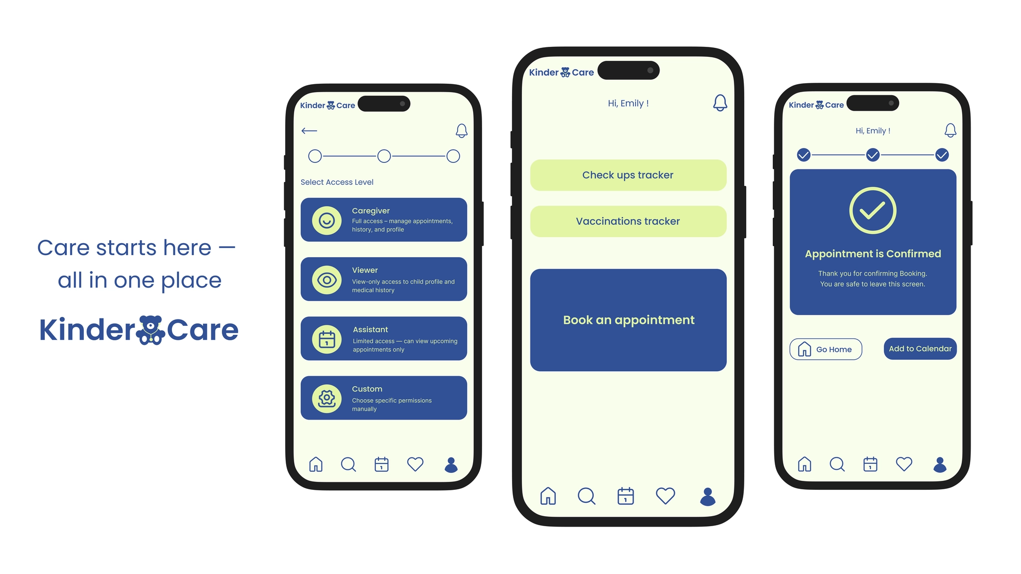
1. Fast Appointment Booking with Smart Filters
▶ Try it in Figma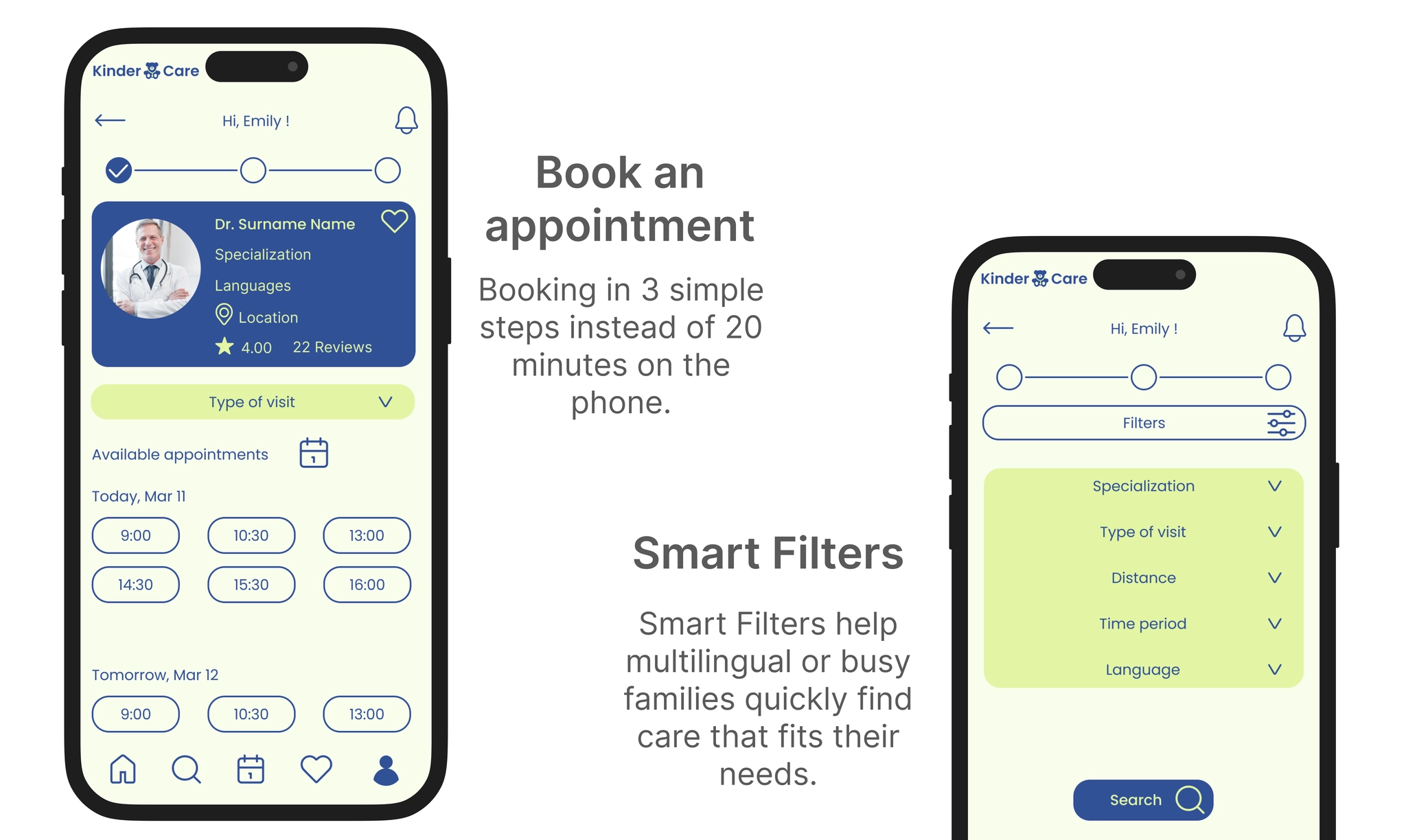
Booking in 3 simple steps instead of 20 minutes on the phone · Smart Filters by specialization, language, distance
2. Health Timeline: Check-ups & Vaccinations
▶ Try it in FigmaAll preventive care in one clear tracker: upcoming, overdue, and completed visits
3. Caregiver Access
▶ Try it in Figma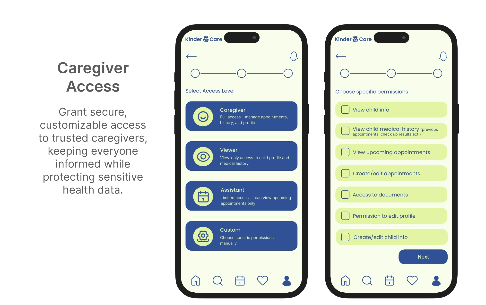
Grant secure, customizable access to trusted caregivers while protecting sensitive health data
4. Multiple Children in One Account
▶ Try it in Figma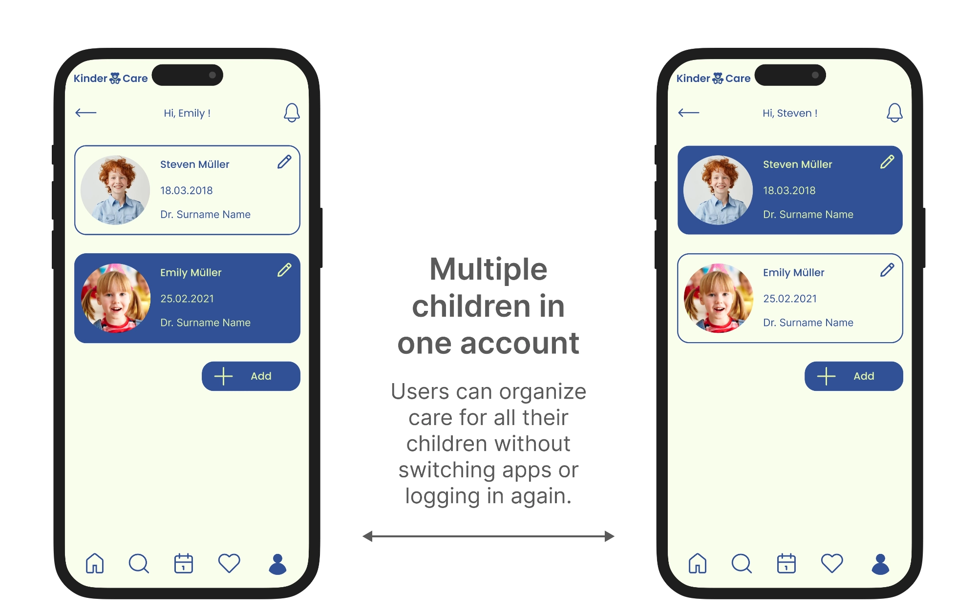
Organize care for all children without switching apps or logging in again
Process
Primary Research
Method: surveys and semi-structured interviews (n = 8). I combined surveys and interviews with parents and caregivers — including working parents, low-vision caregivers, and elderly caregivers with limited tech confidence.
💡 Key insights
Parents hate waiting on the phone — they want quick, reliable ways to book appointments.
Co-parents and extended family need easy ways to stay in the loop.
Accessibility is non-negotiable — if it's hard to use, people will just call instead.
Busy parents rely on reminders — automated notifications reduce missed appointments.
Simplicity in onboarding and navigation is crucial for older or less tech-savvy caregivers.
Empathy Maps & Key Pain Points
Based on the interviews, I created empathy maps for each participant — what participants say, think, do, and feel. The research uncovered three key pain points:
⚠️ Navigating complex apps with tiny icons, menus, and distracting elements frustrates users.
⚠️ Parents want confidence that their children's health data is safe and secure.
⚠️ In urgent situations, many users still prefer calling rather than using online booking.
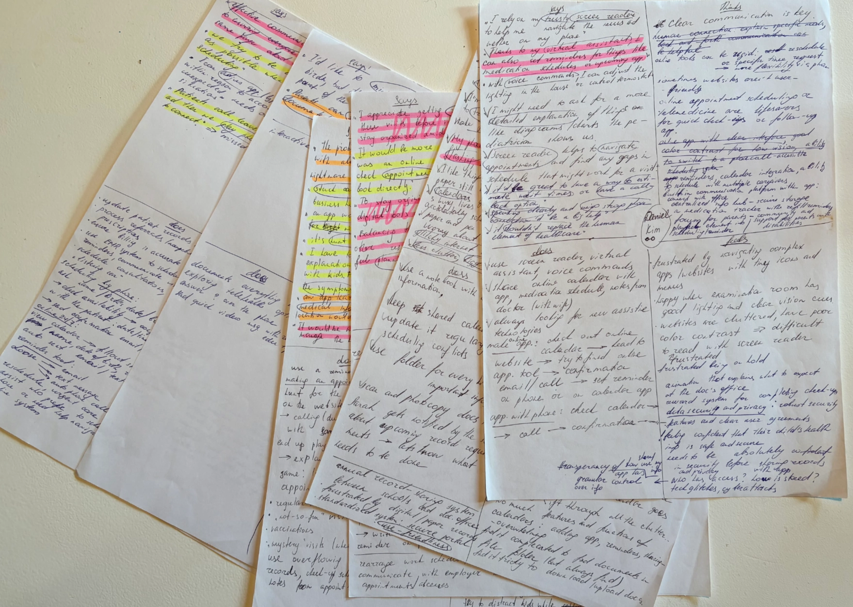
Primary research notes from interviews with parents and caregivers
Personas
Based on user research, surveys, and interviews, I developed three personas — a primary user and two key edge cases.

A working caregiver managing healthcare needs of one or more children.

An elderly caregiver who needs extremely simple tools to avoid sensory overload.

A non-native German-speaking parent requiring clear communication to manage healthcare.
Journey Map
I created a journey map to visualize the primary user's steps, emotions, and pain points throughout pediatric care. Improvement opportunities are color-coded: 🔴 Red = high-priority, 🟢 Green = secondary improvements.
Board not loading? Open Journey Map in Miro →
Information Architecture
I developed an information architecture to organize content and features logically. Color-coded: 🔵 Core structures, 🟢 Core content, 🟣 Reusable booking module, 🟠 Buttons.
Board not loading? Open IA in Miro →
Wireframes & Iterations
I moved from paper sketches → mid-fidelity → high-fidelity, validating hierarchy and interactions at each stage.
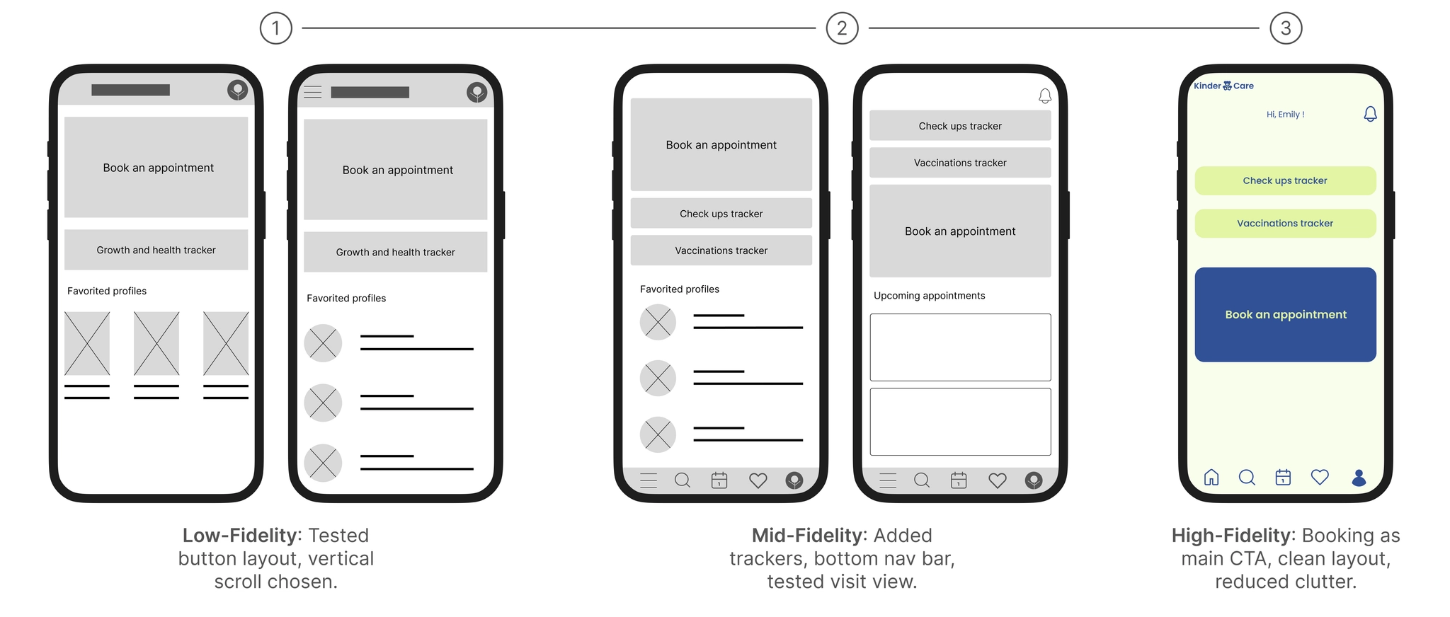
Homepage: Low-fi → Mid-fi → High-fi. Booking elevated as the single thumb-reachable CTA.
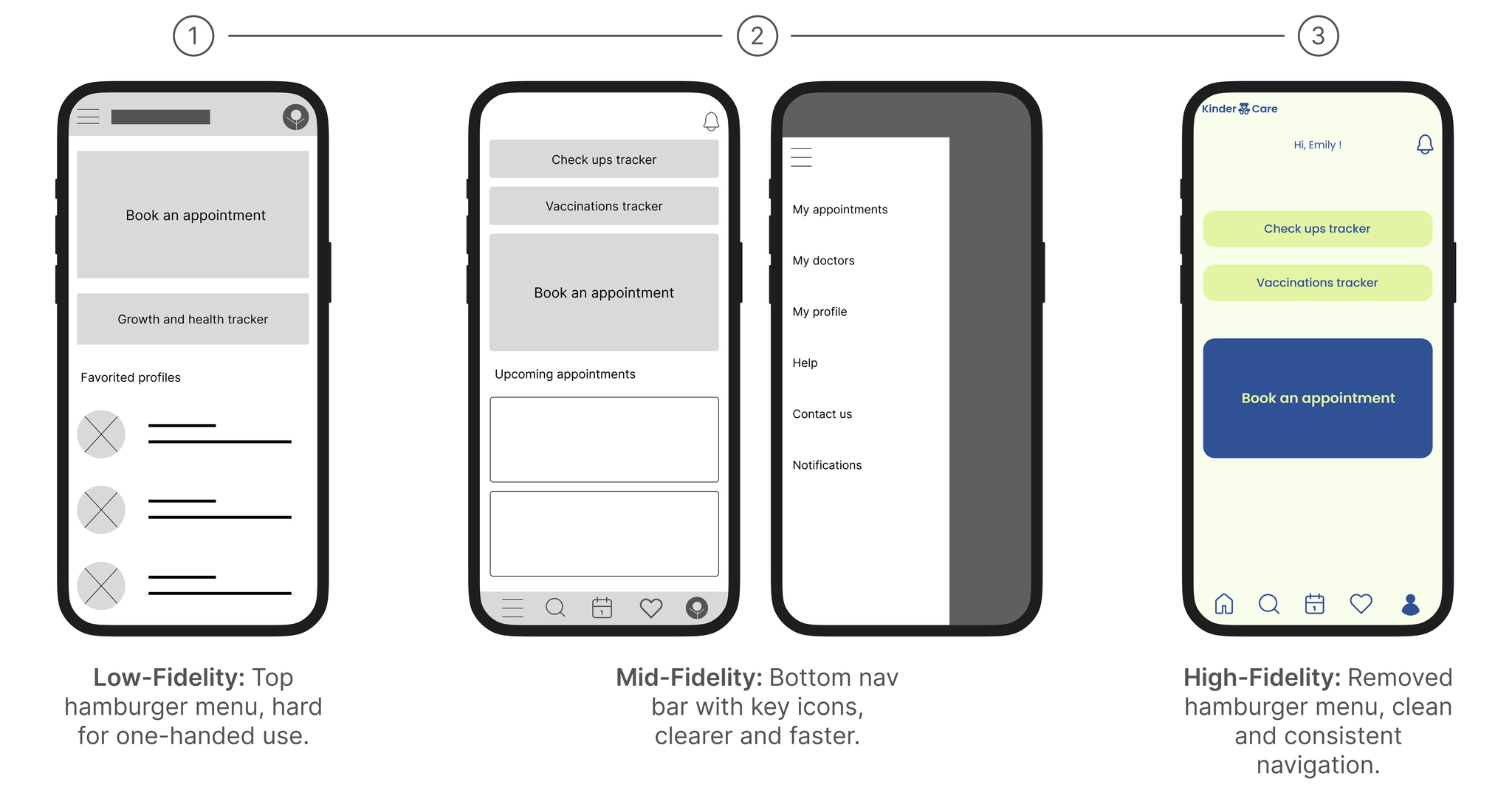
Navigation: Hamburger menu removed in favor of bottom tab bar with clear labels.
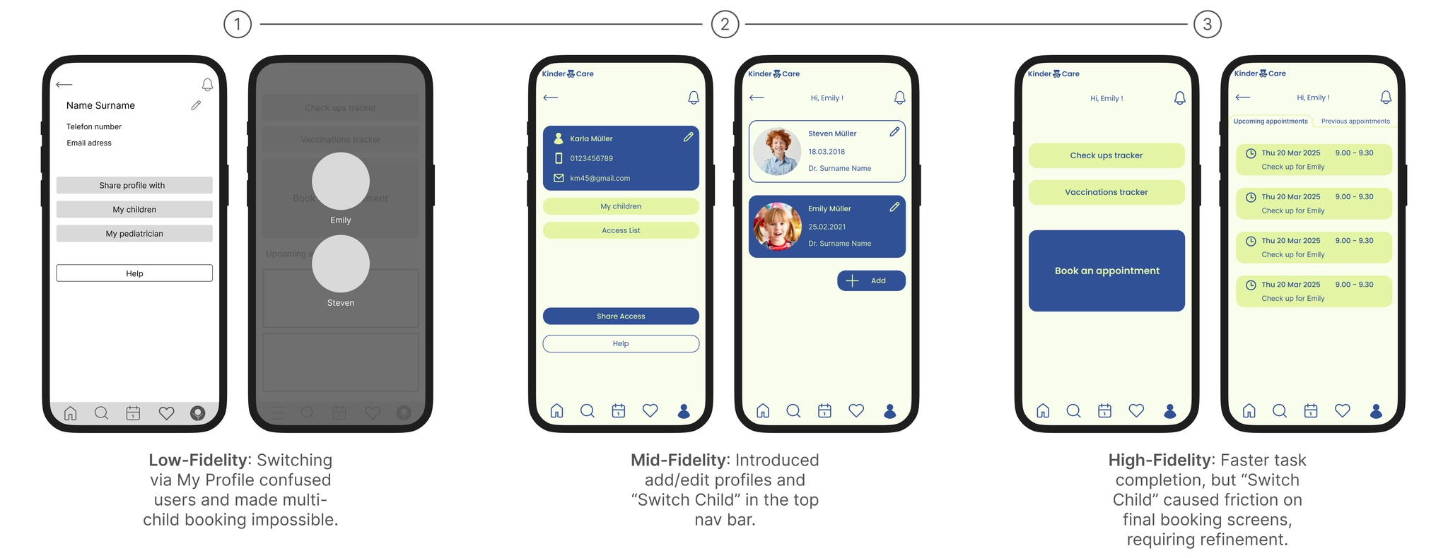
Child Profile Switching: One-tap access from any screen via top nav bar.
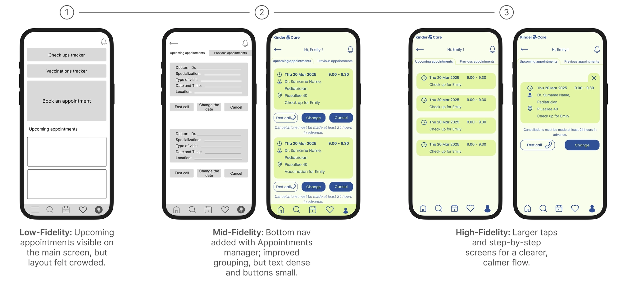
Appointments Manager: Larger tap targets, clear visual hierarchy, calmer step-by-step flow.
Usability Study
Although this was an educational project with limited resources, I included a light quantitative layer to complement qualitative insights.
| Metric | Pilot result (n=5) | Future target |
|---|---|---|
| Booking completion rate | 5/5 | ≥ 90% |
| Average time to book | ~2–3 min | < 3 min |
| Share access completion | 4/5 | ≥ 90% after copy/flow fixes |
| SUS score (approx.) | ~75–80 | > 75 ("good" usability) |
| Calls-to-clinic during booking | 2/5 participants | ↓ 30% after improvements |
| Child-switch confusion | 2/5 users struggled | Minimal after refinements |
Numbers based on a small pilot. Future work would expand with larger samples and formalized metrics.
Key Flows
Flow 1 — Book an Appointment
Goal: Fast, intuitive booking for caregivers with limited time or language barriers.
▶ View interactive flow in Figma- 3-Step structure (Search → Select → Confirm) reduced friction and supported fast decisions.
- Progressive disclosure — only relevant fields shown at each step.
- Confirmation screen using closure principle built trust before booking.
- Multilingual filters — include doctor's language, addressing non-native speakers.
Flow 2 — Share Access
Goal: Balance privacy, simplicity, and accessibility for multiple caregivers.
▶ View interactive flow in Figma- Predefined access levels (Caregiver / Viewer / Assistant) reduce cognitive load.
- Customizable permissions support real-world caregiving complexity.
- Post-invite transparency — always see who has access, reinforcing trust.
- Language-agnostic icons help multilingual caregivers.
Flow 3 — Health Timeline
Goal: Prevent missed appointments, reduce stress, and centralize preventive care.
▶ View interactive flow in Figma- Action-oriented timeline — all preventive care in one place (upcoming, overdue, completed).
- Conditional actions (Call / Book) keep the UI focused.
- Automated reminders prevent missed appointments.
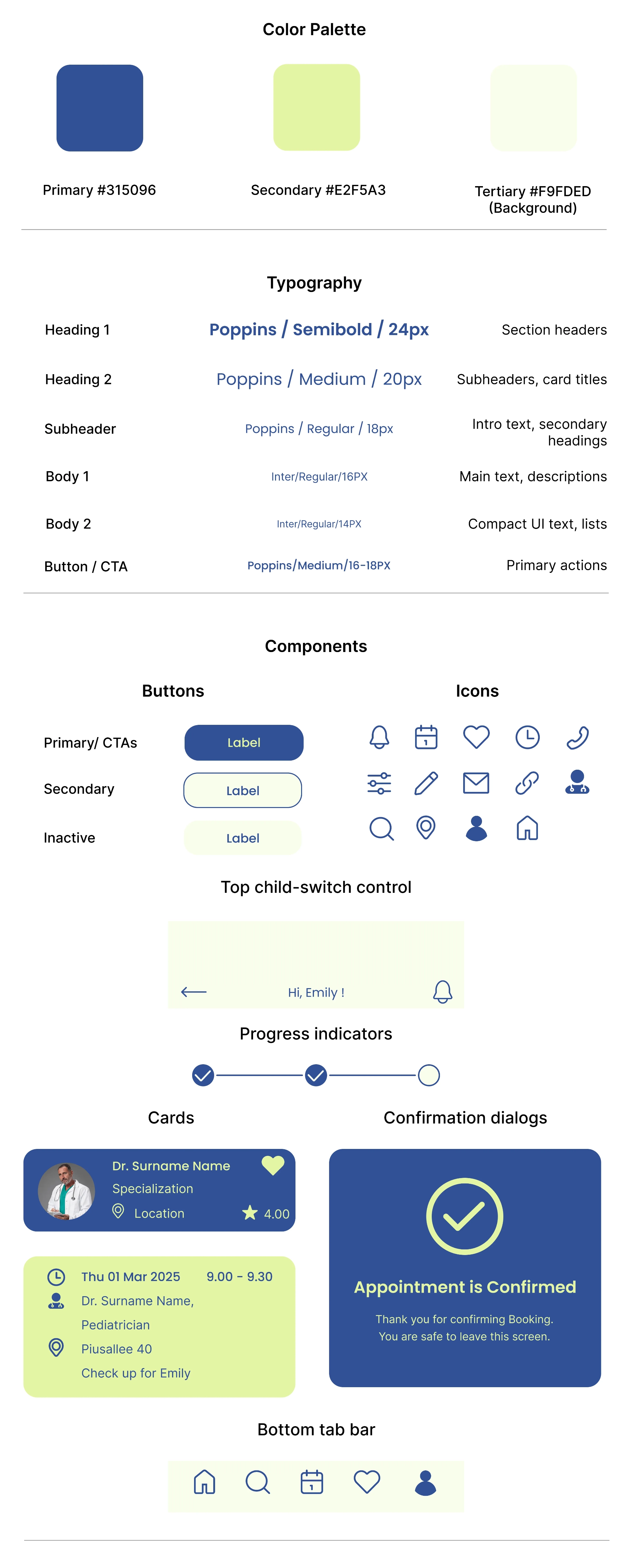
Style Guide
I built a soft, accessible visual system around two core tones: reliable blue (#315096) for clarity and focus, and optimistic lime (#E2F5A3) for warmth and approachability. Poppins for headings, Inter for body text. All interactive elements meet WCAG contrast requirements.
Conclusion
Accessibility-first design and iterative testing improved usability for low-vision, elderly, and multilingual caregivers. The project's value goes beyond the final prototype — it's in the principles I'll carry forward.
What worked: high contrast and large tap targets improved usability for all users; focused CTA + bottom nav reduced friction; predefined sharing levels increased confidence; mixing qualitative and light quantitative data added depth.
What I'd do differently: add simple metrics from round one; test copy sooner with A/B tests; document accessibility in components upfront.
💬 Even though the app aimed to reduce phone calls, caregivers valued the one-tap call option — a reminder that people need human connection even in digital solutions.
Let's connect
If you found my work interesting, I'd love to discuss opportunities or collaborations.
💎 Help me make my work better
Thank you for taking the time to review my portfolio! Your feedback will help me improve as a UX designer. This will only take 2–3 minutes. Responses are anonymous.
Leave feedback →